Showing posts with label renaissance wax. Show all posts

Monday, 3 August 2015

An Amazing, Scientific Comparison Test, honest. . .

Well, I had a thought the other day. A dangerous concept I know,
"You don't want to go messing around having thoughts" I said to myself, "You never know where it might lead. No good will come of it, mark me words. ."

Yeah, well, I needn't have worried, nothing much came of it.

The thought in question came upon me when I happened to notice that I had four different brands of white polymer clay lurking in my clay storage box. This same thought led me to suppose that I could do one of those super efficient, scientific, comparison type things you see online. I could compare how well different brands of PC cope with the image transfer process, and I could intelligently but casually point out the differences etc, thus adding to the sum knowledge of mankind, and keeping the polymer clay community informed and and forearmed against the vagueries of image transferring onto whichever was the clay of their choice. . .

Well. . it didn't really turn out like that.

OK, this is what I did. I rolled out a suitable sheet of four different clays,
Kato white, Fimo Pro white, Sculpey original white, and Cernit opaque white.

Then I did my usual - like everybody else does - water and rubbing technique, image transfer thing on each of them, using similar images from the same sheet of lazer printed paper.
Below is how they turned out. The image quality was pretty much identical. One 'interesting' point was that the surface of the Fimo pro, where the image wasn't, started to turn a bit grainy, a sort of floury texture as it was eroded by rubbing. The image bit was fine. Also Fimo white is 'whiter' than the others, just a bit.
The image on the Kato white felt slightly rougher somehow, as if bits of it were very slightly raised. None of these things had any bearing on the image quality at all. Even the much maligned Sculpey original performed well.


So then I baked them for about 20 or so mins at 135 degrees C. Below is how they turned out. Again, nothing frightening or unusual as far as I could see. The Sculpey orig seems to have moved slightly towards the redder end of the spectrum, but only very slightly. They all look marginally darker, but that is mainly due to the photo.


I cut the squares out, as I figured I might try to use them at least, as they didn't do anything exciting in my supposed experiment. I cut them out with scissors, which was novel, as I usually cut them out with a craft knife before baking.
Once cut out, I painted the backs and sides with 'Ginger' alcohol ink and treated the whole thing with Renaissance Wax and buffed them up a bit. 
Then I decided that they were too 'bendy', meaning they hadn't been baked enough, so thinking 'What the hell." I chucked them back in the Halogen oven for another 20 mins. 
Maybe a bit long, as they all bent up a bit as the image side seemingly shrank a touch. They were all suitably stiff and hard though. The odd one out was the Sculpey Original, it went a pinky purple! I 'think' it was the renaissance wax melting and dissolving the ink or toner and diffusing it across the surface. Very odd. (Ren wax and toner don't get on.) Might be something to play with in future and see what cool effects could be got. . . hmmmm. .
The Kato came out the hardest and stiffest, with the Fimo and Cernit being a bit bendy but v tough. The Sculpey was pretty strong, but would probably snap if you really bent it hard. But then, why would you do that?


So, my expert conclusion about which brand of Poly clay to use for image transfer is? . .
That it doesn't really matter. Sculpey Original would need to be a touch thicker or have a thin backing sheet made of one of the tougher brands to be useful in more demanding applications, but it is perfectly ok, as long as long as you don't rebake for too long after using ren wax on it. An unlikely circumstance, unless you are me. . .
Oh well. . . . Mankind's knowledge will just have to wait for another day for my input OK?
Jon x

Thursday, 11 June 2015

Well it was there last time I looked. . .


The other day somebody bought one of my cufflink sets on Etsy.

'Hooray!' I said and trundled over to the shelf where I keep my jewelry stuff and pulled out the most likely box.
Nope, not in that one. No worries, it will be in the box with my other cufflinks. . .
Nope. . . OK, well it should have been in that box, maybe I put it somewhere else, though I can't think why. .

Yeah well, you can see where this is going. The cufflinks weren't anywhere they ought to have been or anywhere they didn't ought to have been, and I still haven't a clue what happened to them. I looked everywhere. . About six times. . . Grrrr. . .

I shamefacedly contacted the buyer, apologised profusely and explained. I suggested I could try to make a replacement set, send a photo to see whether she thought the replacement was adequate, and if not give a refund. She said that was a good idea, so I set to.

As I set up the necessary bits and pieces, it occurred to me that it might be a good idea to document the process as I hadn't tried that before, so I took shots of the various stages of my image transfer and nasty aging process and montaged them into a series of jpgs for your amusement. I hope you're easily amused. It's almost a tut, but would need work to make it coherent enough for that. It's more of an experiment. I might try documenting stuff again but with more care and a better set up.


1- cut out images from laser print/photocopy sheet.
2- cut out squares of polymer clay, thickest setting on the pasta machine.
3- trimmed images and squares.


4- place the images face down on the squares and rub gently with your finger to ensure contact.
5- add water and let it sit for a minute.
6- gently rub away the paper with your finger in a circular motion, adding water from time to time. Go easy as it can start to smudge after a while.
7- the image/soft clay will probably distort a bit if you aren't careful enough. I wasn't.


8- don't do what I did and forget to place the squares on a small tile to start with. I had to lift them off my work tile with a blade, which also distorts the shape. Not a big issue this time as I wanted a slightly irregular shape.
9- put small tile in oven. I did 25 mins at usual temperature.
10- baked squares. The camera angle makes them look more distorted than they were.
11- selectively attack with medium sandpaper.


12- results of selective sandpaper attack.
13- I painted the surface with greyish alcohol ink diluted with isopropyl - ratio 1 ink 2 iso p.
14- gently added renaissance wax, but rubbed it in too hard. see top right of left square, the blue has come off leaving purple/magenta where blue should be. Ren wax will take the image off if you aren't careful.
15- buffed with dremel thingy after ren wax had dried for ten mins or so.


16 - the final result. Overdid it, so I made another less messed up version.


This is a pic of the second, less messed up version I made. These made it to the stage of cufflinks. Check the pic below of the 'lost' original ones and see if I got close. The originals weren't quite as brown in real life as in the photo btw.
Let's hope the buyer gives the OK. ;-)
Jon x


Monday, 1 June 2015

Life gets in the way

Not that messing about with polymer clay and blogging about it isn't part of 'life', but it does tend to get subsumed by other stuff, when said other stuff raises it's ugly head. Sorry not to post sooner. Not that you were waiting with bated breath, or 'baited breath' as I have seen people spell it, now there's a surreal concept. . .

We've been away for a few days, cruising the villages of Suffolk to see what the places where vaguely possible houses for sale are situated. (we haven't sold ours yet, but research was needed) Interesting stuff.

pretty stuff


Some pretty bits, and some right crap. If you were ever thinking of checking out Friday night in Stowmarket, not that any of you are in a position to do that, I would advise against. It was a flippin wasteland! Deserted streets, the two pubs we could find just had a couple of fat blokes with shaved heads watching sport on a bloody great telly. The sign outside one had 'Friday Night Explosion!' chalked onto it. Yeah right. Friday night Mouse fart more like. . . Totally our scene. . . not.
About the most exiting thing happening was that the branch of Subway was open. . . The town's depressed looking teenagers were huddled round it and round the steps of the baptist chapel or somesuch building nearby, poor things. There was more life in the Asda car park than on the high street. . .

Anyway, real life apart, I have been messing about with poly clay a bit. I bought some titanium wire, as it's hypoallergenic and cheaper than sterling silver. It has a dull finish, but I like that. It fits the vibe of my work better than something shiny does. imho.
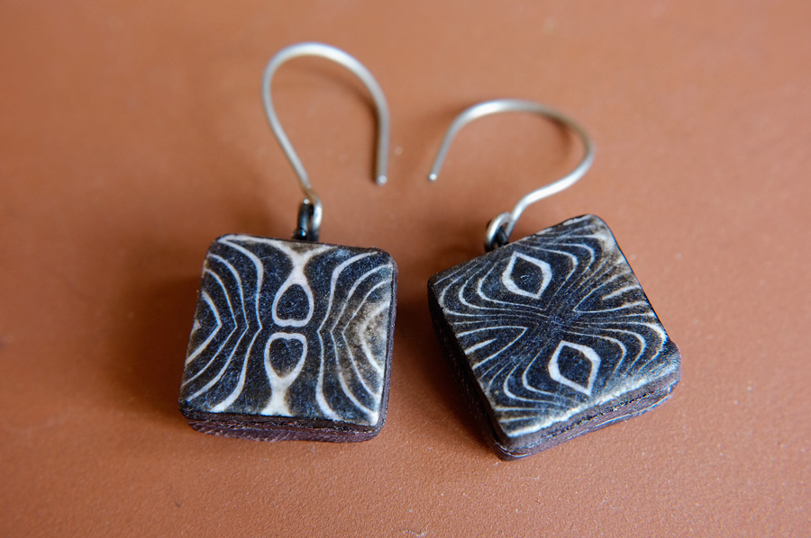
Here's a couple of sets of earrings I made using some black and white image trans beads and said titanium wire.


I was wondering whether I should offer a set of two of earring that actually match. I like unmatched, but there may be those who might be put off by that. Not sure I want to cater for such unadventurous types ;-) but I might try a set or two in my shop as an experiment. Or I might not.


And I made some 'Dread beads'. Not sure whether you sell these individually or in sets. I shall research. I used at least four coats of Renaissance Wax on them, buffed up on my dremel between coats. That should render them weather and sweat proof, or am I being optimistic here? Should I varnish them?

Monday, 18 May 2015

Down in Black and White


I'm having a bit of a black and white frenzy at the minute. I have a load of these simple, faux African style images (of my own design) lurking on my hard drive, that I figured would look really nice as beads. So I have transferred a batch of them onto some Cernit squares and have been experimenting, trying different sizes and thicknesses of beads to see what I like best,. And ultimately, I guess, what other people like best. The ones in the pic are mainly 15mm square with a couple or three 20mm ones lurking in there too. A few are hollow ones, using my go to method, Claire Maunsell's strata bead technique which she helpfully shared online  and which I jumped on as it suited my impatience and my 'rustic' leanings. . .
The rest are just two pasta-machine-thick-settings thick. All are painted black on the back and sides with black alcohol ink, treated with renaissance wax and buffed up. Oh yeah, and I made a couple of artily mismatched cufflinks too. 


I didn't age any of them up for a change, though the temptation is hard to resist. I'm going to make a bunch more and mess them around like the ones below. They just look so cool all antiqued and ancient relic-ified. . 
And they sold. . . ;-)


The other thing I did with some more of the longer rectangular beads like the ones above, was to wrap them round some tube bead cores, and see how that came out. I decided to put them all together in one necklace, and after a bit of trial and error came up with the idea below. I need to take some better pics but I liked how the silver tone spacers worked with them. What you reckon??


Some, if not all of these will be making their way onto my Etsy shop in due course, so look out for them. I'm still considering in what form to sell them, bead sets, earring sets, made up earrings. . . hmm. . But that's food for another post I think.
See ya next time, which, despite my good intentions is likely to be another ten days away, judging by my past efforts, and hey, don't be shy about commenting, no pressure though.
Jon x


Thursday, 12 March 2015

Image Transfer mutterings vol 300. . - So much for Dye Sub


Well, after meaning to get round to trying out my dye sublimation heatpress on baked polymer clay for ages, I finally tried it out today. 'Disappointing' is the word. For a start, the poly clay stuck to the top 'platen' of the heat press and had to be hurriedly scraped off. Then the paper stuck to the clay during the dye sub process and had to be soaked off. And once everything had dried out from that it all looked extremely dull and uninteresting.


I tried Renaissance wax on top but that wasn't much better. I tried fine sandpaper, to see if I could sand down to something stronger, as the image would be part of the clay, but it was only fractionally better.
The left hand one is sanded and waxed and buffed. It's sort of OK, but not really worth the effort.


I was perplexed because on the right substrate, in this case an mdf coaster coated in a special pvc related substance, the image is bright and pretty clear. Polymer clay should have the right chemical make up to take dye sub inks. . .

So, forget dye sub, says I. I might try cutting up an mdf coaster and dye subbing onto the bits in order to make small image tile things, but that feels a bit like cheating, as I wanted to find ways of getting better images onto Polymer Clay. . .
Oh well. . .


At least the mice in the garden were on my side. Look what they left for me to find under the damson tree. These would be fun to incorporate into some kind of jewellery I think.


And these, they left were left under the cherry tree.
Thanks mice ;-)

Sunday, 15 February 2015

Surface treatment - When does 'Distressed' become 'Messed up'?

Is there actually a dividing line? I am really enjoying seeing how close to total irreparable messed-up-ness I can take my image transfer bead 'ageing' process. It's a learning curve, and once you have taken a process too far, you can take a more informed view on how far to take it the next time.

Here's how things start out. Images transferred onto poly clay squares, in this case, using dye sub paper and kato trans liquid. This shot is after baking, obviously. You get a slightly fuzzy, out of focus effect, and some randomly dodgy edges. All of which is fine, as it all adds to the finished look. Neatness can be achieved with more care, if neatness is your thing.


Here's a shot of my desk with some of the above as finished beads, after the 'distressing' or 'messing up', (whichever it is deemed to be) process.


A closer view of the greeny brown ones. Sanded quite hard, as scratching Kato clear is not as easy as plain baked clay. Also, the scratches aren't visible until some darker ink/paint/whatever is applied and encouraged to sink into them.


This is what happens when the process is taken a bit further. These beads are slightly different in that the image trans process was the more usual one using a laser copy/print and water on plain white clay, or a 10% kato trans, 90% white poly clay mix. (Images 'stick' better with a bit of trans clay in the mix).
As there is no liquid clay involved, the surface scratches and distresses more easily. The image comes out sharper than the dye sub ones too. The other thing that happens with this method is that when Renaissance Wax is used at the end of the process, and rubbed in, it starts to dissolve the image. If you apply it carefully and leave it to dry for half an hour or so, it will buff up without too much of the image disappearing, but if you rub it in hard and buff up after a couple of minutes a fair bit of the image is removed. I like both effects. The top left bead has almost entirely lost the image, but looks cool all the same. imho.


These next ones are where it gets close to or over the dividing line between 'distressed' and 'messed up' that I am wittering on about. I like the kind of 'ghost image' of the pattern in red that gets left on the two on the right. This technique does make me wonder whether I should make some beads with no image on them at all, just madly messed up surfaces. I like the look, and losing the image, as in the bottom left bead, doesn't detract from it's coolness all that much. But overall, the ones where the image is still reasonably discernible are my favourites. How 'bout you?